Problem + Opportunity
How can a 'Task Management' app help prevent shrink?
Enterprise data showed that stores were losing millions in revenue because damaged or expired goods weren't being reported for credit. This revealed a clear opportunity to extend the product into these workflows, surfacing the information needed to drive revenue recovery and strengthen compliance at both the store and enterprise levels.
My Role
UX Design Lead
I led end-to-end research and design for a new feature that would bring a new extension of our application to a first-time user audience across 2,000+ nationwide stores. As UX Design Lead, I owned the design vision and research strategy, translating insights into design decisions.
Collaborators
- Product Manager
- Engineering Team
- Business Analyst
- UX/UI Designer
- UX Manager
Methods
- Workshop Facilitation
- Product Design
- Interactive Prototyping
- User Research & Testing
Platform
Android
Current State
What we knew
I conducted a series of discovery sessions with stakeholders and cross-functional design teams, documenting insights on a central digital whiteboard. This effort streamlined our focus on shrink, clarified user-centered design challenges, and synchronized our roadmap with adjacent initiatives.

Focusing Our Goal
We understood from our enterprise-level SME that shrink resulted greatly from outstanding credits and from too much vendor product. We understood that the Receiver had many responsibilities beyond this, but we'd need to focus results in this space.
Known Challenges
Our existing application was tailored to work related to receiving distribution center product. Receivers' work rarely intersected with this, if at all. We'd need to develop for a net new user who was equipped with separate, third-party tools that they used to receive product.
Strategic Partnerships
A separate team was working with a vendor to advance features of a third-party application used by the Receiver. Aligning with this team early, we had a clear understanding of their current and future development and their limitations.
Discovery Research
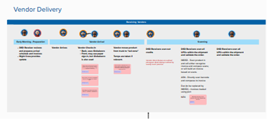
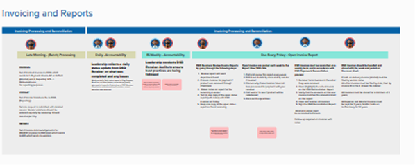
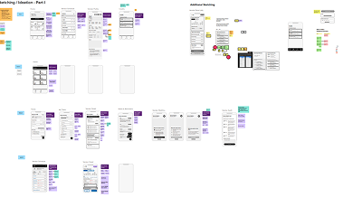
What do tasks look like in practice?
I led the planning for this research: defining what we needed to learn and creating guidance for in-store interviews, observations, and documentation. This supported a group of consultants conducting research across a range of stores of different sizes, regions, and markets.And, to help ground my understanding, I participated in several in-store interviews.
I translated these findings into maps that showed where the work was breaking down and how different roles and tools interacted. Additionally, I compiled proto-personas from our conversations to help remind the team of real-world challenges, mental models, and different kinds of Receivers might have different needs.
What factors impact receipt of credits and product volume?
How might solving this problem impact the Receiver, if at all?
What are current perceptions or interactions with our application?
Key Research Findings
How did research shape the design?
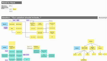
Our solution should...
- improve visibility
- simplify complexities where possible
- NOT create additional work
- add value for Receivers AND business
Shifting Priorities
We observed work environments that constantly pulled Receivers' attention in different directions. Their work is highly time-sensitive and requires constant prioritization and communication.
Many Tools + Devices
We observed Receivers switching between tools and devices as they shifted between tasks. Receivers rely on multiple, required third-party tools and devices.
Needed Visibility
We heard from both Receivers and Store Managers that success was achieved through regular communication. Limited visibility into other store activities increases coordination effort.
Unfamiliar with App
We confirmed our assumption that Receivers recognized our application, but not all interacted with it. It was considered a 'Night Crew App,' not relevant to their work.
Ideation
What should we build?
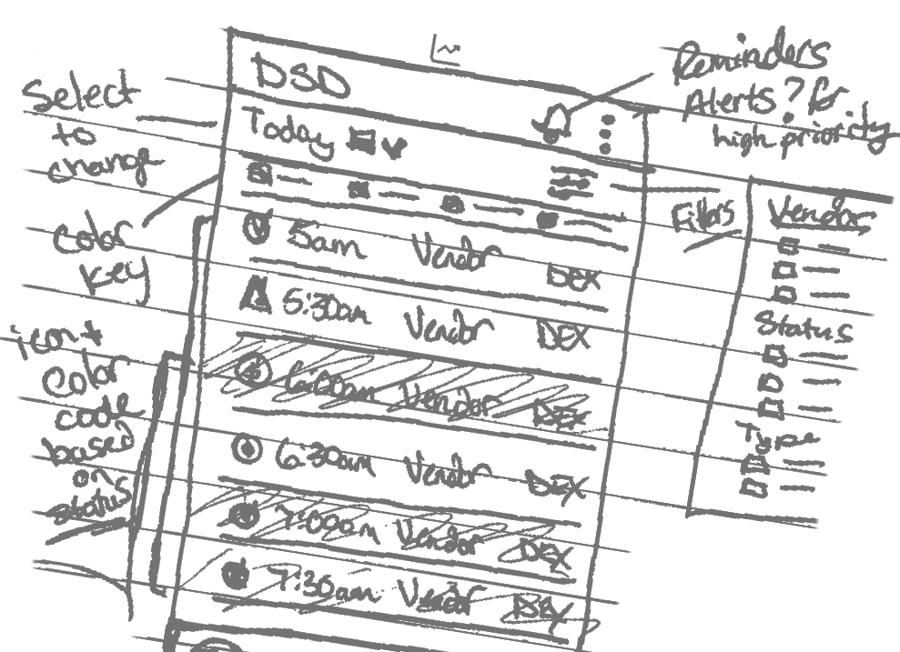
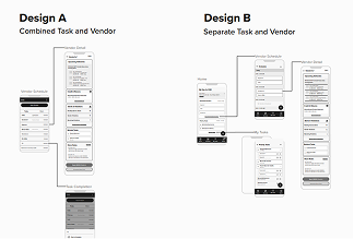
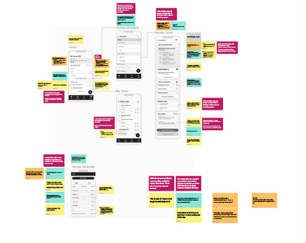
I led workshops to translate research into early concepts, using discussion, co-creation, and voting to prioritize ideas. We narrowed a wide set of directions to two solutions for testing.
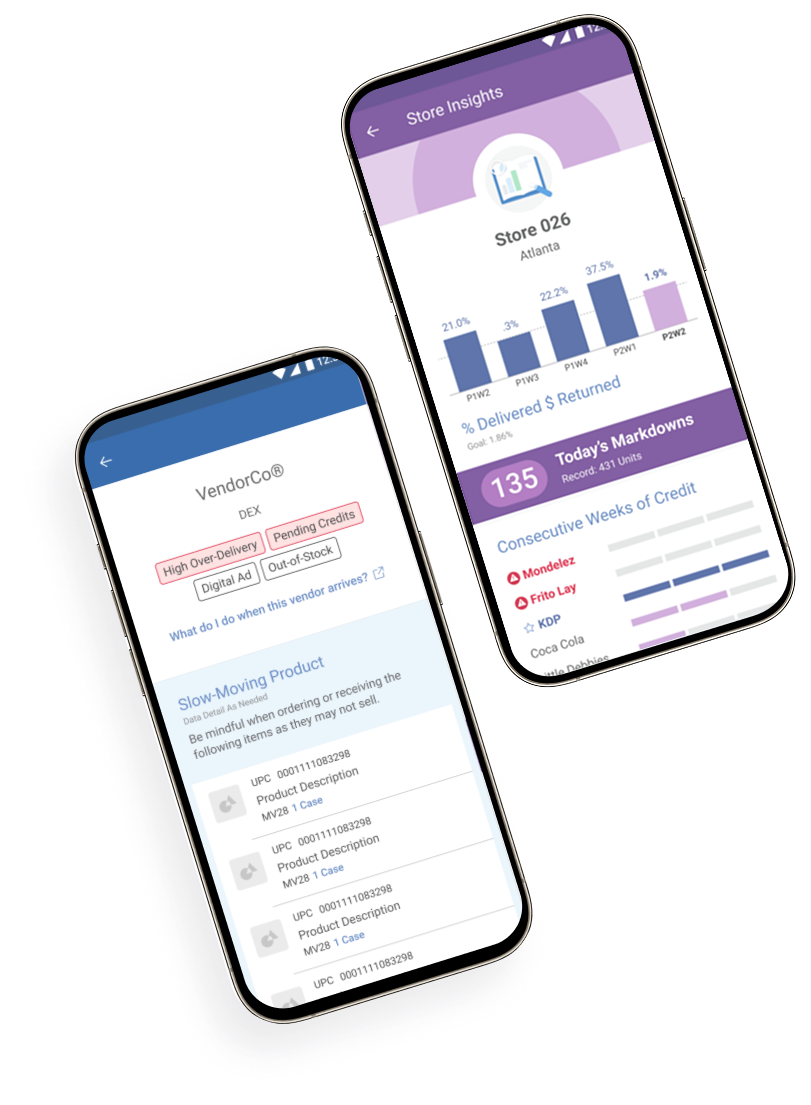
As design lead, I built the prototypes and defined the core interface and interactions through iterative testing and refinement. The final solutions gave Receivers a clear daily task view and a single access point for their tools, replaced paper processes with guided digital workflows, and improved visibility so the entire store could stay aligned.
Testing & Iteration
Is this the right solution?
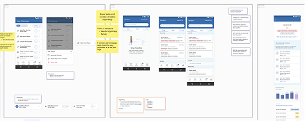
As a part of this effort, I presented the MVP and select future features in a virtual forum for managers across 2,000+ stores.
Since our junior designer and engineers were invited to sessions and regularly updated on research and testing findings, I was confident when handing off design files for pixel-perfect UI refinement and development. Notes with user-insights for features and quick links to artifacts within my Figma file, paired with open lines of communication, helped ensure the integrity of our designs and kept users at the through-line of decision-making.
Results & Achievements
What changed because of this?
Unlike past projects, my involvement came to an end before the team had developed and released a functioning prototype.
Discovery efforts, however, surfaced conversations about larger organizational needs and would inform a future roadmap beyond my contract.
Had I remained on the team, I'd be eager to measure adoption among Receivers and monitor any impact on unclaimed vendor credits relative to usage metrics.
Want to learn more about this project?
Contact me:
kristy.graybill @ gmail.com